
Save Your Business by Avoiding These 9 Examples of Dreadful Web Design

The saying ‘you never get a second chance to make a first impression’ is as true in the digital marketplace as it is in brick and mortar businesses.
Flawlessly executed web design is essential for you to make sure first time visitors to your website become loyal customers. Doing anything less will annoy your customers at best, and send them to a site belonging to your competition at worst.
This begs the question, what constitutes bad web design? Here are a few examples of exceptionally poor websites.
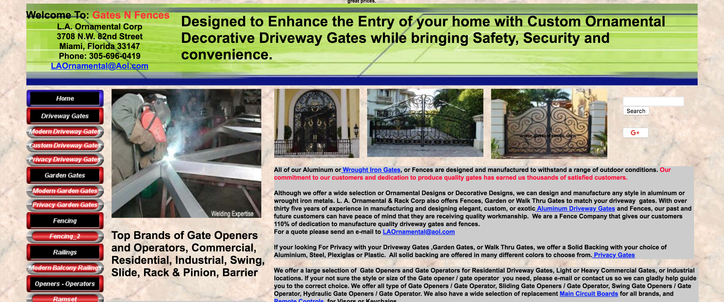
1. http://www.gatesnfences.com
From the first glance, the site appears overwhelming. They have too much of information crowded on this page. The images and the sidebar only add to the confusion customers feel when trying to search for any specific information here. The tiny font is difficult to read much less quickly skim through, and single-spaced small font is almost unmanageable.
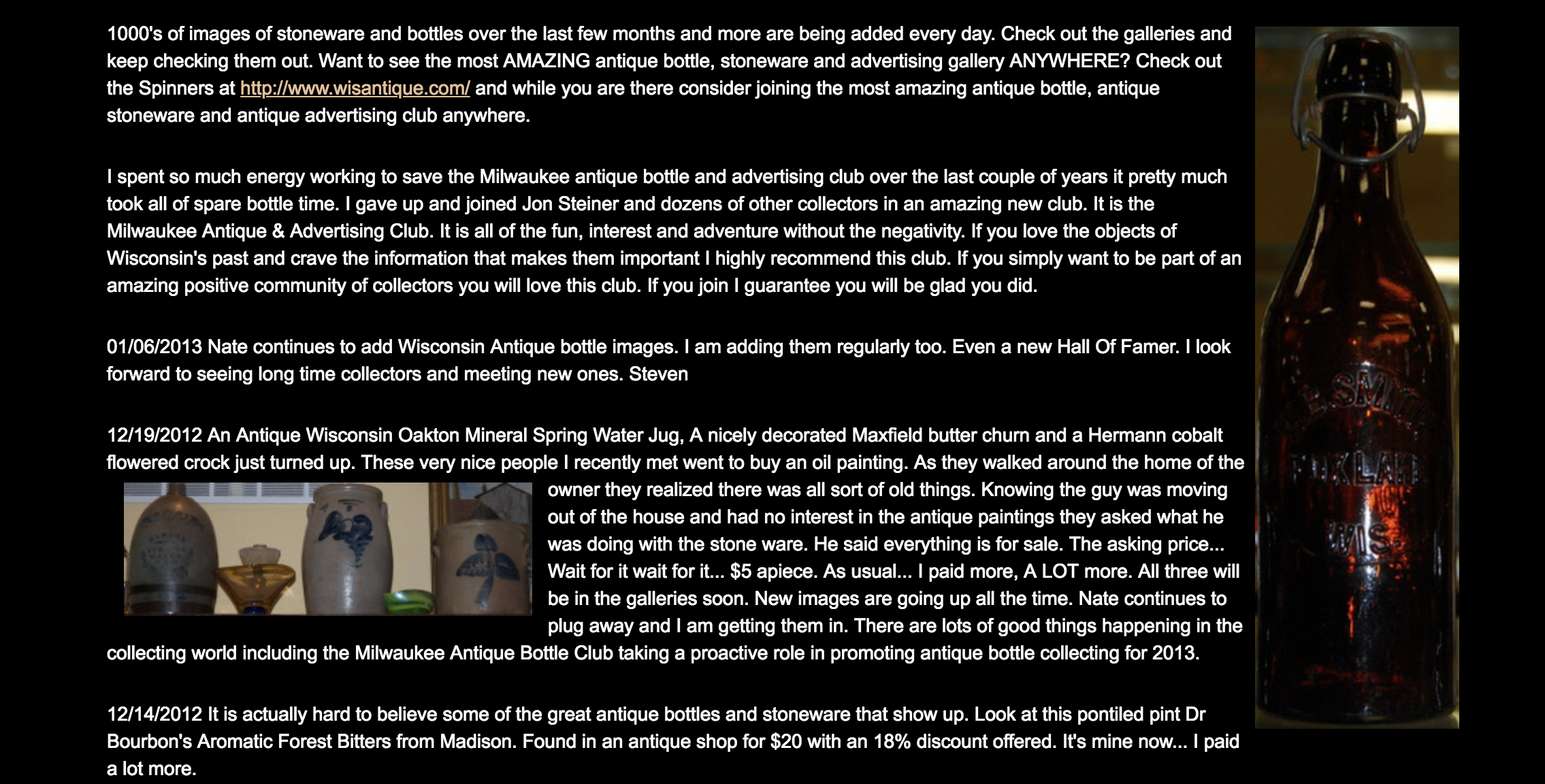
2. http://www.mrbottles.com
Mr Bottles has too many things going on at the same time. The fonts and placement of the heading are difficult to read; adding the spinning emblem is a distracting idea that adds no value to the page. The small white single-spaced type is challenging to read, and the information lacks a clear direction.
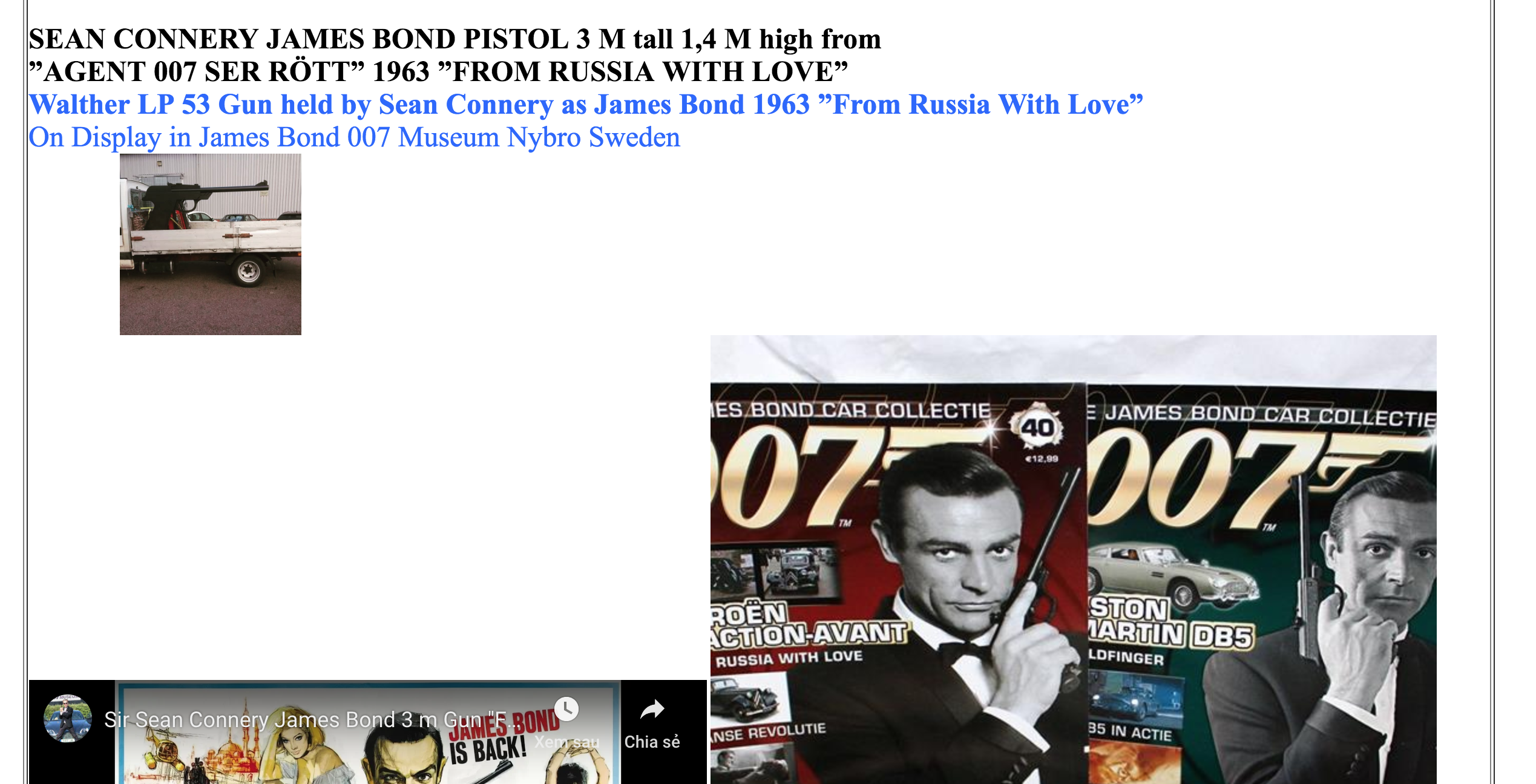
3. http://www.007museum.com
The site for the James Bond 007 Museum loses credibility almost immediately. If you strain enough to read the tiny font, you’ll see it uses the word “apparently” to describe a piece of memorabilia held at the museum.If the web site owner cannot definitively own a bit of information, visitors to the page will disregard the site and any credible content it contains.
The changing font colours and poor use of punctuation are distracting. Even if this museum held the most prolific collection of memorabilia on the face of the Earth, nothing on this web page points to it.
4. https://mammascheesies.weebly.com/
At first glance, you may think this website isn’t so bad. However, take a closer and you’ll see random navigation that leads nowhere, Google search result text (which means nothing), and other elements that make this a poor customer experience.
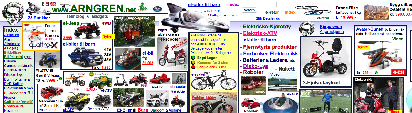
5. http://www.arngren.net
My personal favourite.
The language used in this web page is irrelevant because there are so many small bits and pieces of information and advertisement scattered haphazardly about the web page, few visitors to the page would want to know more about this company.
Clearly, there is no thought to using a grid on this site. The contact information is quite difficult to locate and becomes lost in the crush of all of the images and tiny text. Random moving objects haphazardly placed about the web page, include helicopters, reindeer, Santa Clause, robots, snowflakes, and an animated woman removing her bikini top. The footer imagery is equally confusing as well as distracting.
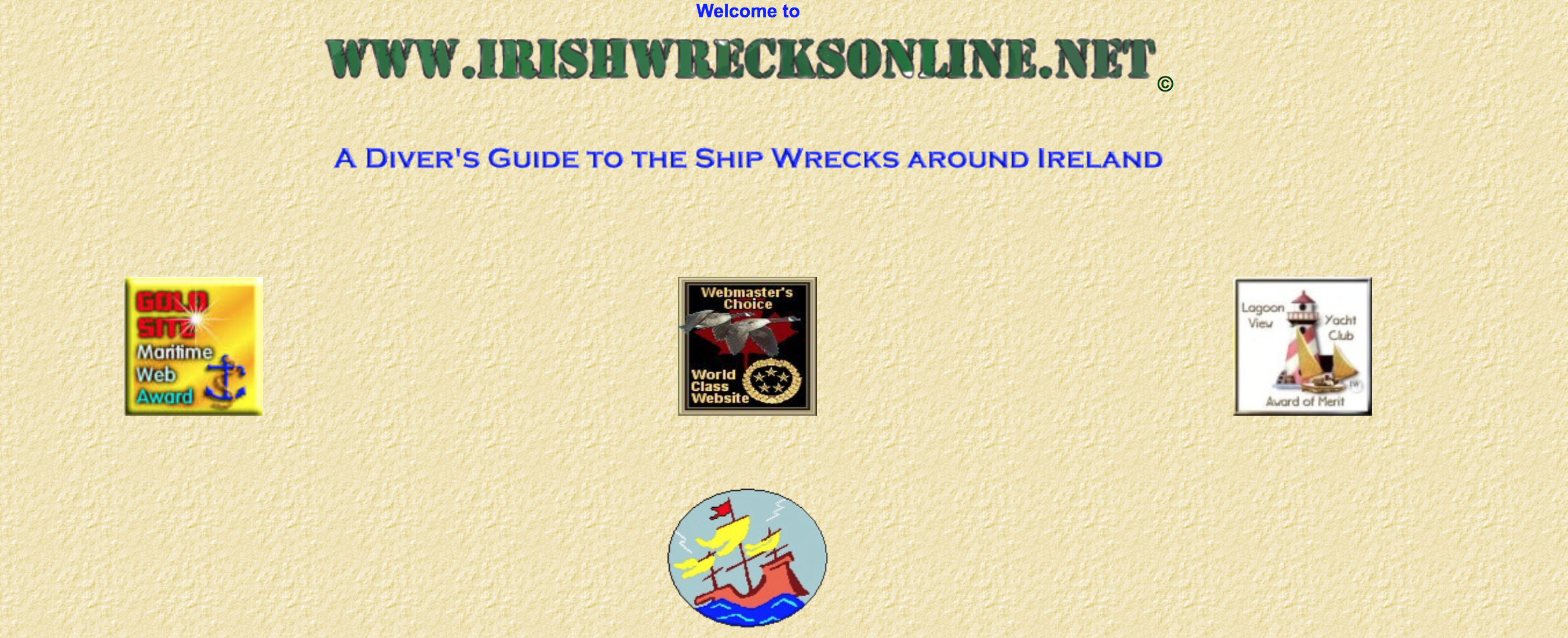
6. http://www.irishwrecksonline.net
According to the site, there are over 10,000 shipwrecks around Ireland. However, the site’s icons are so small; a visitor would be hard pressed to discover any other information on the site. Overall, the site feels very dated. The fonts and the clipart do not do justice to what may be a very compelling web page if properly executed.
7. http://www.pnwx.com/
This site uses a clashing colour palette and an odd combination of fonts. Together these elements combine to make the page difficult to read. A quick peek at a colour wheel would eliminate much of the poor colour combinations and make reading much easier.
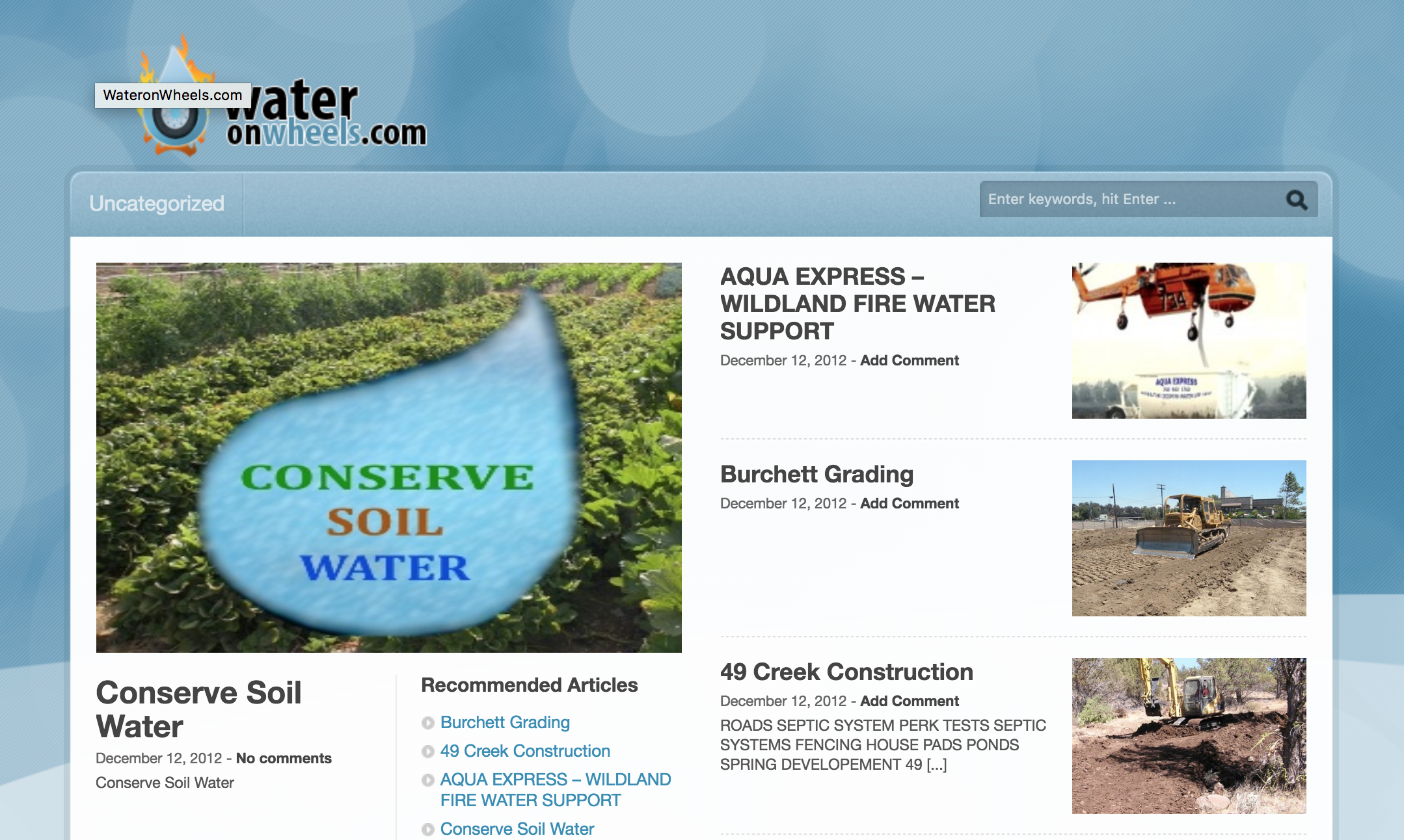
8. http://www.wateronwheels.com
The bright blue ‘welcome’ colour succeeds in achieving contrast with the aqua-coloured background. Unfortunately, the secondary text blends in with the background. The fonts mixed here do nothing to enhance the page, and the abrupt flipping back to the bright blue colour in yet another font is distracting and seems pointless.
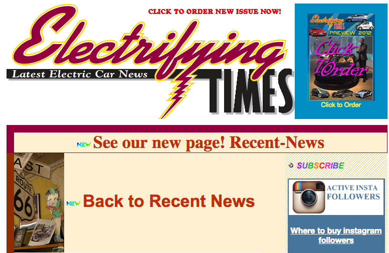
9. http://electrifyingtimes.com
The vast array of spinning and flashing is exceptionally distracting for visitors. The overall feel is unprofessional at best. Far too many fonts make it annoying to read, and the embedded video players cover information that would help visitors.
After seeing a few examples of ways to make potential customers head for the competition’s web page, here are examples of brilliantly crafted websites.
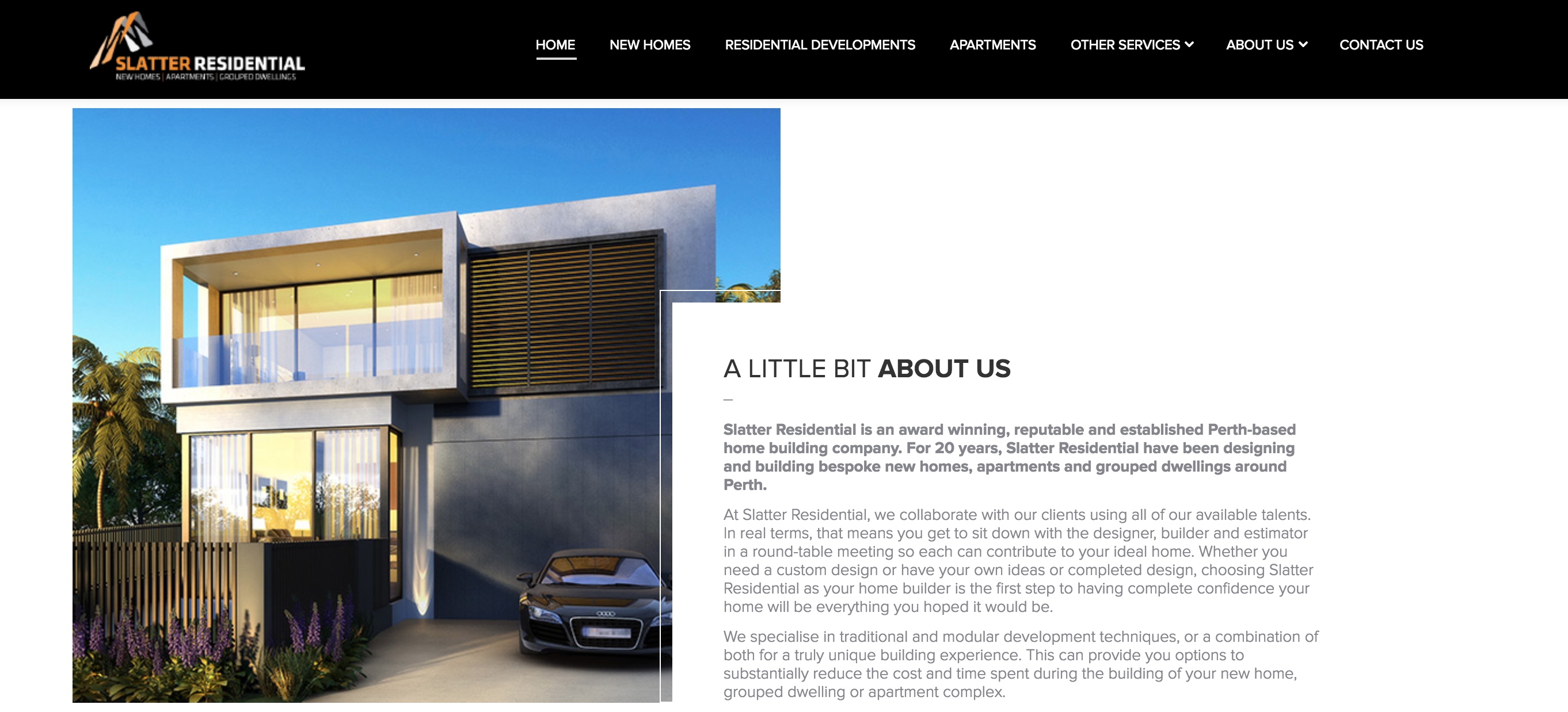
1. https://slatterresidential.com.au
The first thing you notice is what the page owner wants you to see, a fabulous and contemporary home. The text on the page is nonobtrusive, and there are no distractions or gimmicky features to take away from the point of the site.
The information flows logically here and navigating this web site is easy. The images used in the web page are clear, professional, and relevant to the topic. A prospective customer can find the exact information they need easily from the Slatter Residential site, and the page builds confidence in the company.
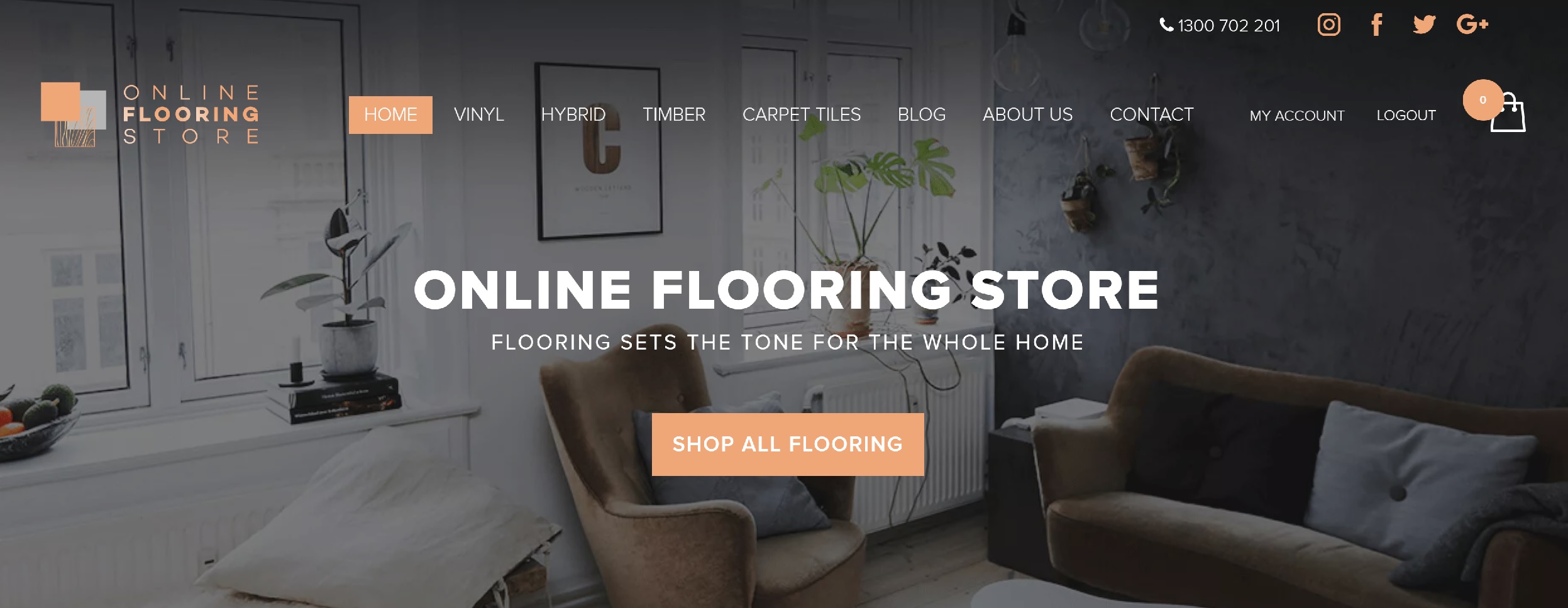
2. https://www.onlineflooringstore.com.au
The Online Flooring Store web site is free of clutter and simple to navigate. It has an artistic feel, but nothing compromises the graphics or background. Using subtly coloured strips made to resemble brush strokes helps highlight pertinent (and legible) information for those who are skimming the page. This site makes a visitor feel welcome and encourages interaction.
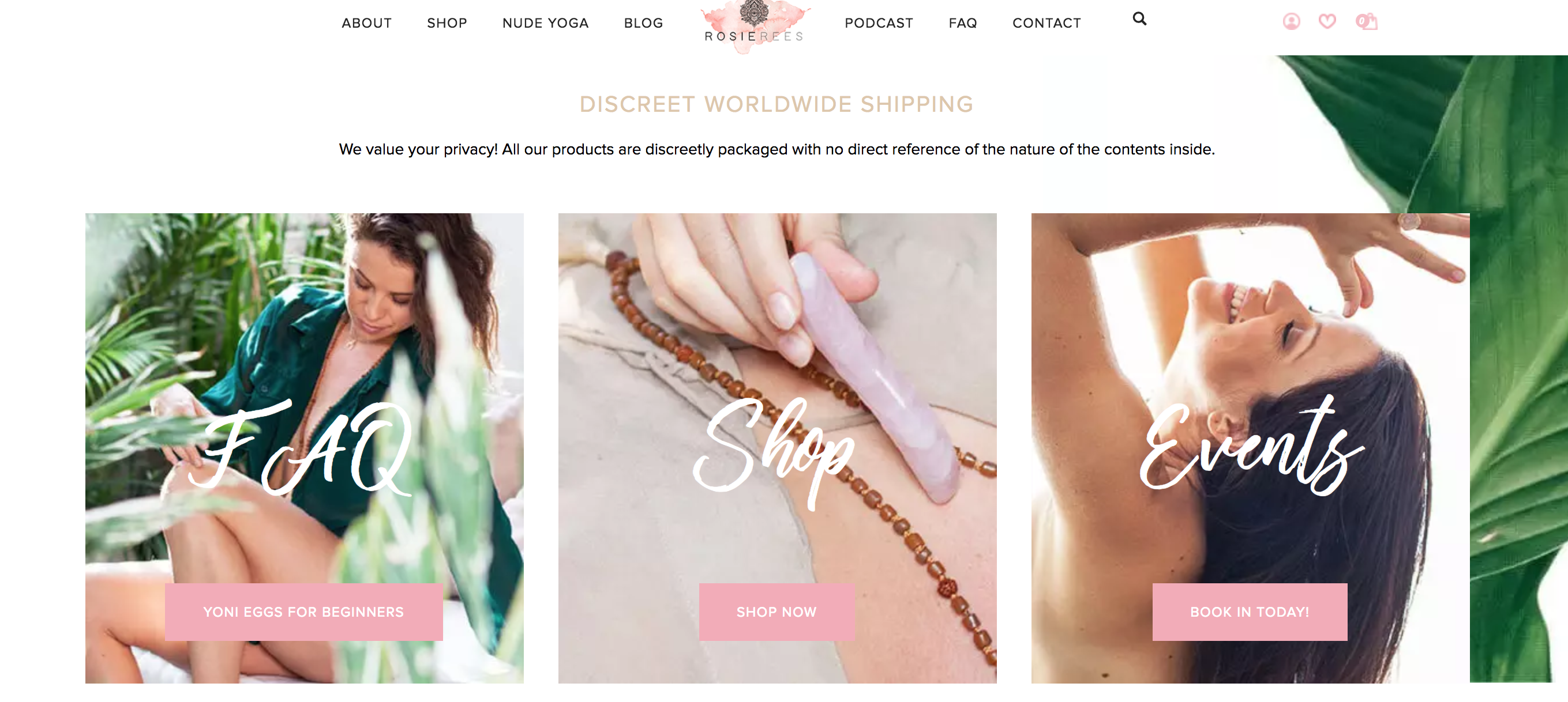
3. https://www.rosierees.com
The Rosie Rees website is an example of how colour, font, and graphics can influence mood when used properly. The theme is sensual, and the website reinforces this consistently. Images are clear and relevant to the site and its products. This is a tricky topic and could have easily gone in one of several wrong directions. However, the expert web page design produced an elegant and easy to use website.
In the world of e-commerce, your business website is your calling card; it is the way you introduce yourself to potential clients and colleagues.
Do not allow poorly designed web pages to mar your first impression. The online marketplace is far too competitive for any businessperson to accept less than excellent website design.